ALWAYS INSPIRING MORE...!!!
This is my
logo 'AO'. 'A' is taken in conjunction with my name as 'ASYRAF' which means the
logo is mine. While the 'O' stands for an organization that I aspire to set up
an organization of my own construction. In addition, there are 2 round shape in
my logo is meant the earth and the atmosphere. now I want to make sure the
beauty of this earth will always be taken care of. For example, when I become a
construction manager in the future I will ensure that building materials I use
are environmentally friendly. Next, 2 eyeball found on my logo is meant always
look ahead. In the present life, the development of every aspect needed to form
the National progress and high self-esteem so that Vision 2020 is achievable.
In addition, we should never forget history because history can remind us about
the past so that we never repeat it again. Next, 3 arrows form available in
every corner of the letter 'A' in my logo is meant to be the direction chosen
by each individual. Each individual should shape the course of his life in the
right direction so that success can be achieved in life. Next, the selection of
colors in my logo is based on the Malaysian flag was 'glorious band' of red
white and blue colors. Although the selection of colors on the flag of Malaysia
but my logo color has a specific meaning. The blue color on the first circle is
meant to give spirit and we all need a high spirit for Luck because when we
fail we will continue to get up to go to the front. Next, the white of the
second circle is meant clean. This is because hygiene is needed in this world
to create a healthy earth without pollution. Finally, the red color on the
alphabet 'A' also means brave. We all need courage to to stand the test in life
because success is not easily achieve and requires diligence.


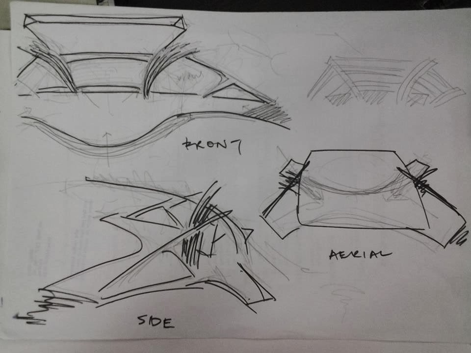


 My sculpture name is
ladders mushroom . This is due to the unique design and highlights the beauty
of the flora. While the 4 poles on hand sculpture is meant those who are doing
the discussion. I took the concept of mildew because it is known as a plant that
quickly growth . This is because time like a gold. Next, I used the color gold
because gold is very valuable and should be treated with care. In addition, we also take care of the world
because of the beauty of this plant cultivation to produce green earth for
future generations. I put together this mushroom like stairs because every
effort must be done in stages, starting from the bottom and each trip must be
no obstacle. Use of a ladder is to facilitate the step leading to the tower
success but if we fall we can still climb stairs again because we want to be
climbing up the stairs step by step, and if we fall we can still continue to
climb as we still stand bag ladder . Next is, sculpture 4 people are talking in
a group. This shows that when we are united we can do the job more smoothly and
be proactive as extensive discussion of each individual view. When we are
broad-minded we can arrange a fast and effective way to head to the top. This
also nurture cooperation and indirectly, we can maintain unity in our country.
My sculpture name is
ladders mushroom . This is due to the unique design and highlights the beauty
of the flora. While the 4 poles on hand sculpture is meant those who are doing
the discussion. I took the concept of mildew because it is known as a plant that
quickly growth . This is because time like a gold. Next, I used the color gold
because gold is very valuable and should be treated with care. In addition, we also take care of the world
because of the beauty of this plant cultivation to produce green earth for
future generations. I put together this mushroom like stairs because every
effort must be done in stages, starting from the bottom and each trip must be
no obstacle. Use of a ladder is to facilitate the step leading to the tower
success but if we fall we can still climb stairs again because we want to be
climbing up the stairs step by step, and if we fall we can still continue to
climb as we still stand bag ladder . Next is, sculpture 4 people are talking in
a group. This shows that when we are united we can do the job more smoothly and
be proactive as extensive discussion of each individual view. When we are
broad-minded we can arrange a fast and effective way to head to the top. This
also nurture cooperation and indirectly, we can maintain unity in our country.